Simple Feast
Brand Refresh
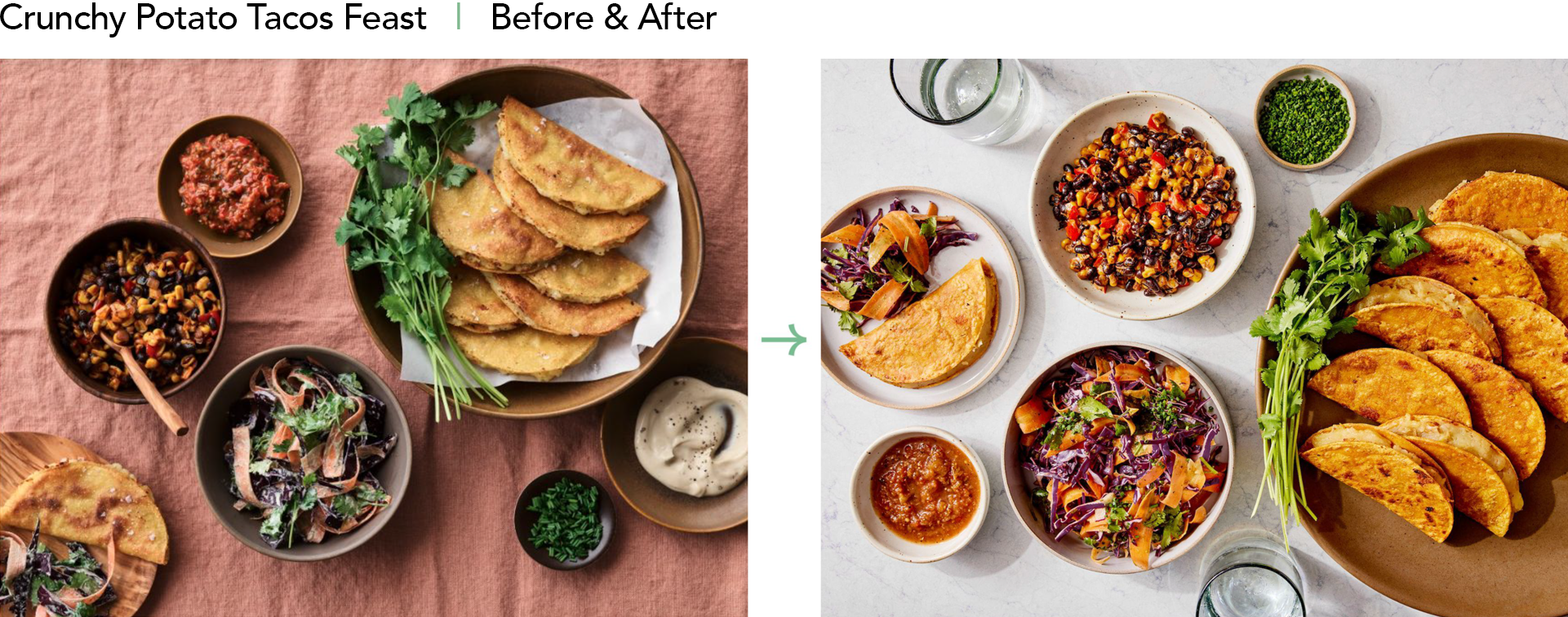
When I came onboard at Simple Feast they had an amazing product with a brand look that was not doing it justice.
The brand and design presence felt like a nice restaurant from the early 90s. The food looked bland and beige was
the primary brand color.
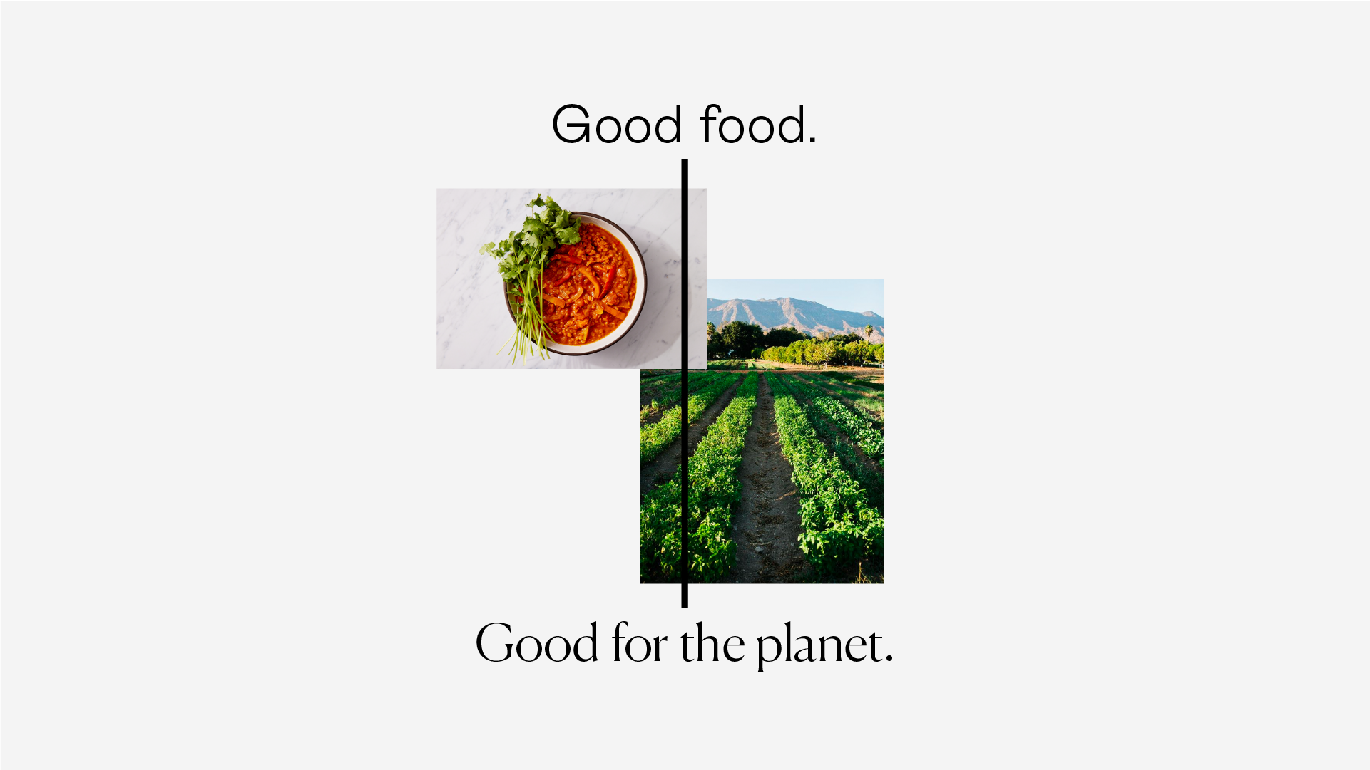
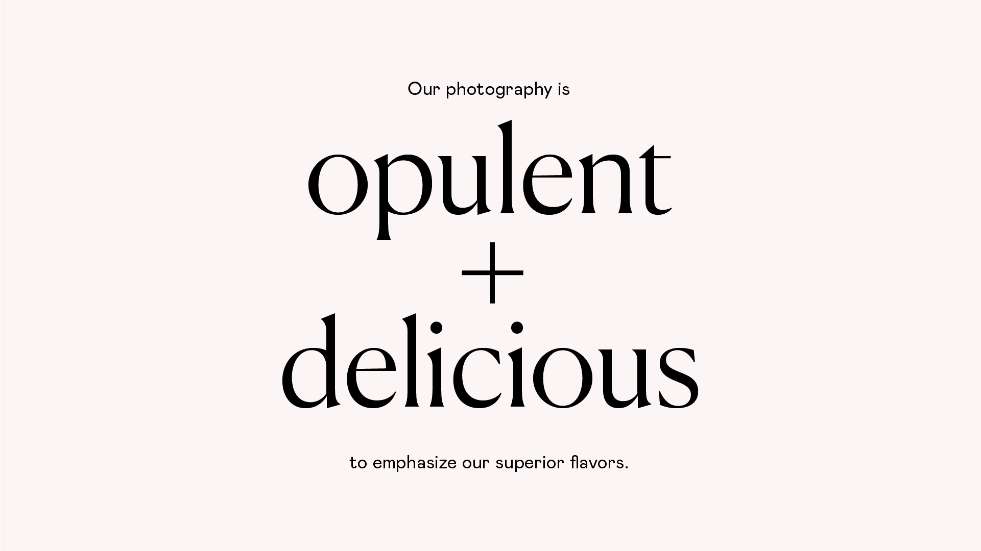
I led and executed a complete refresh with the goal of repositioning Simple Feast as the modern, delicious,
and healthy food brand it is.
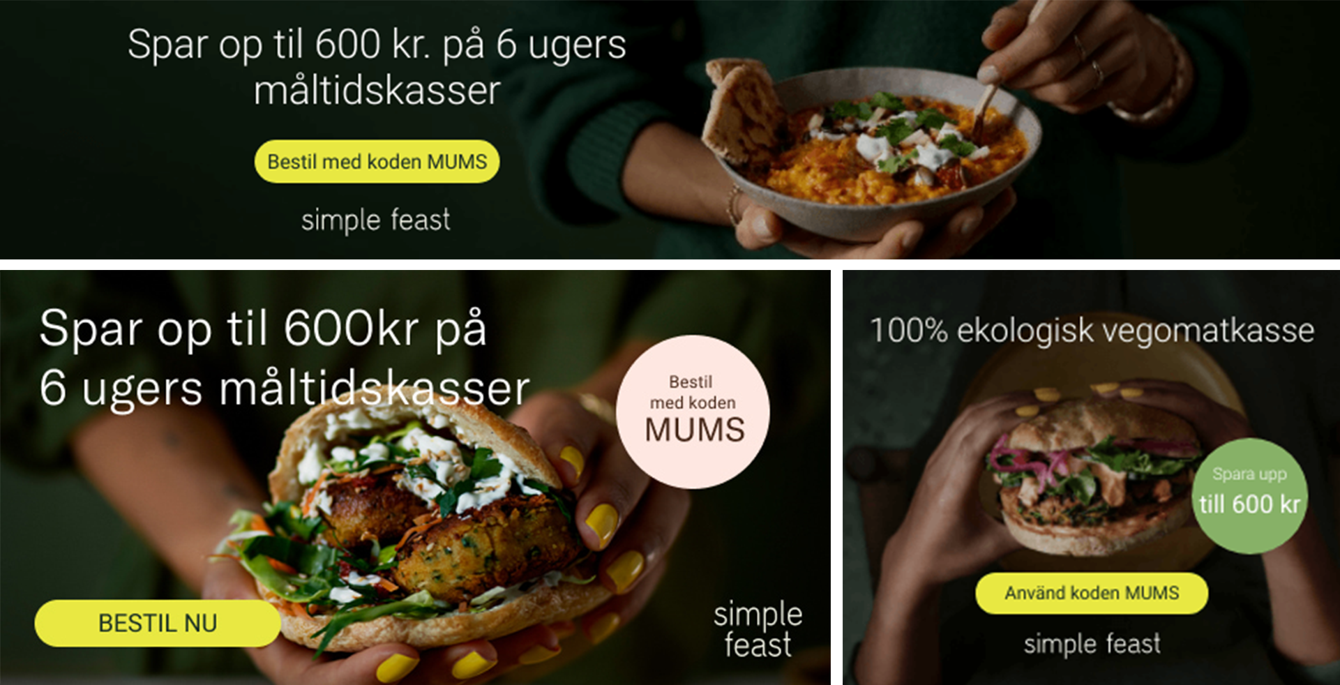
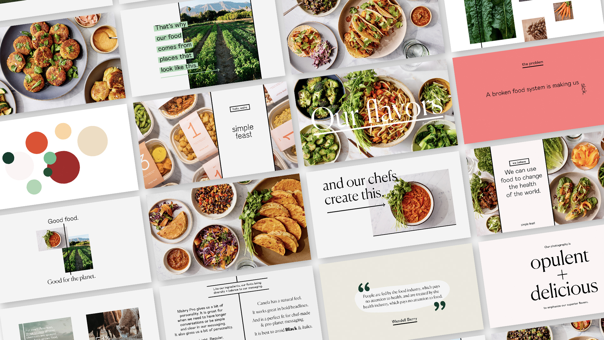
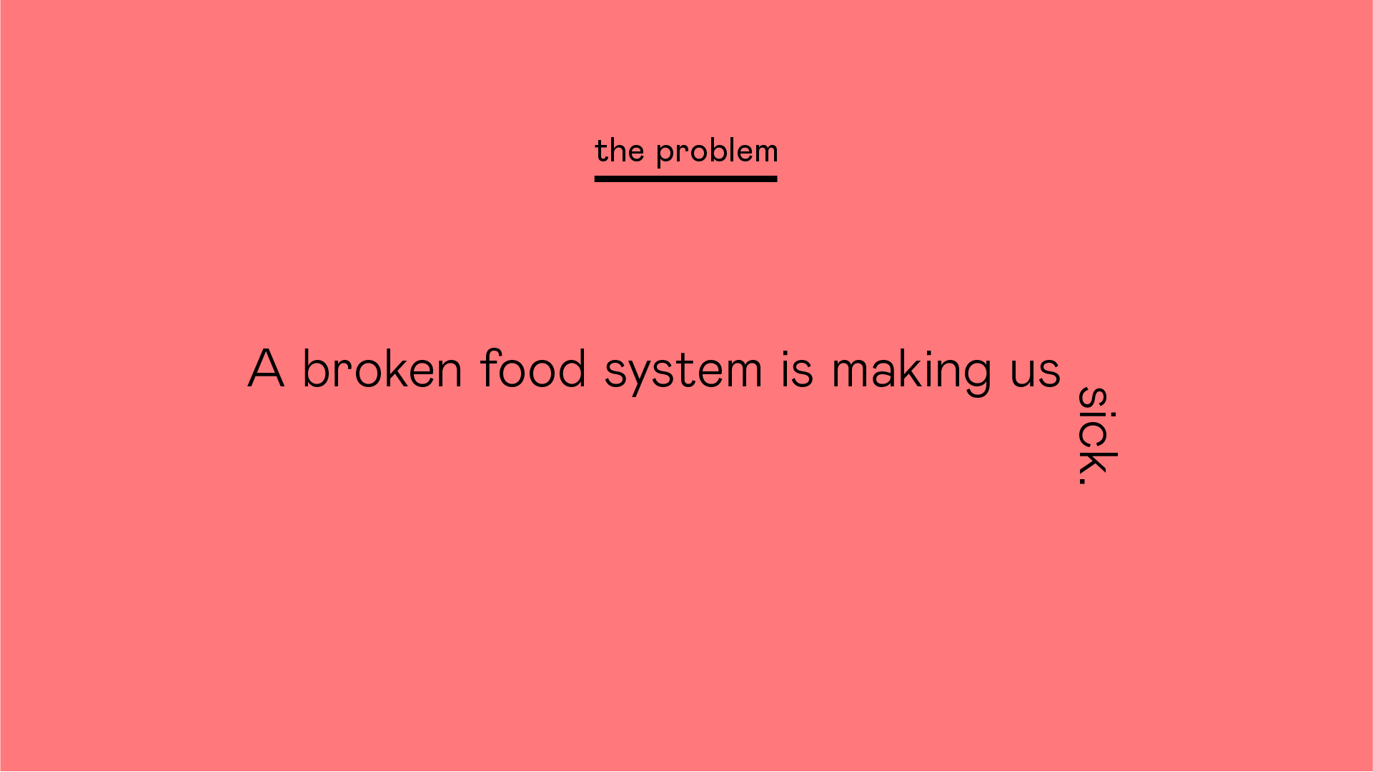
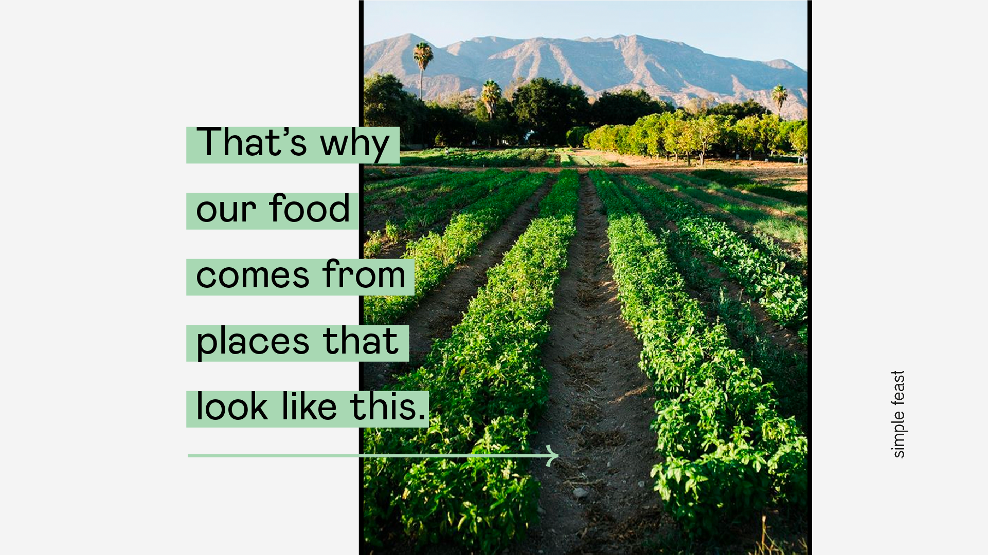
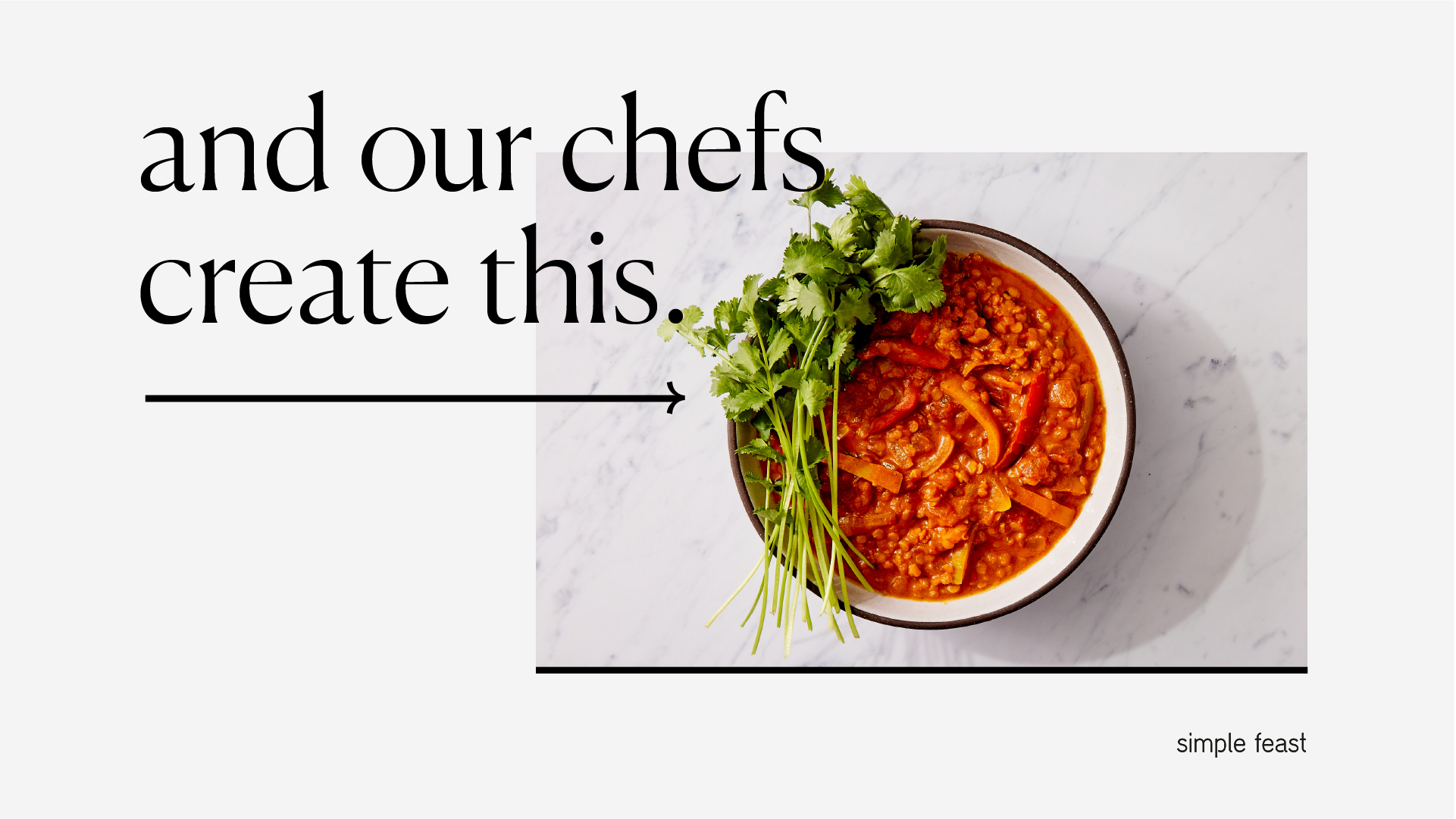
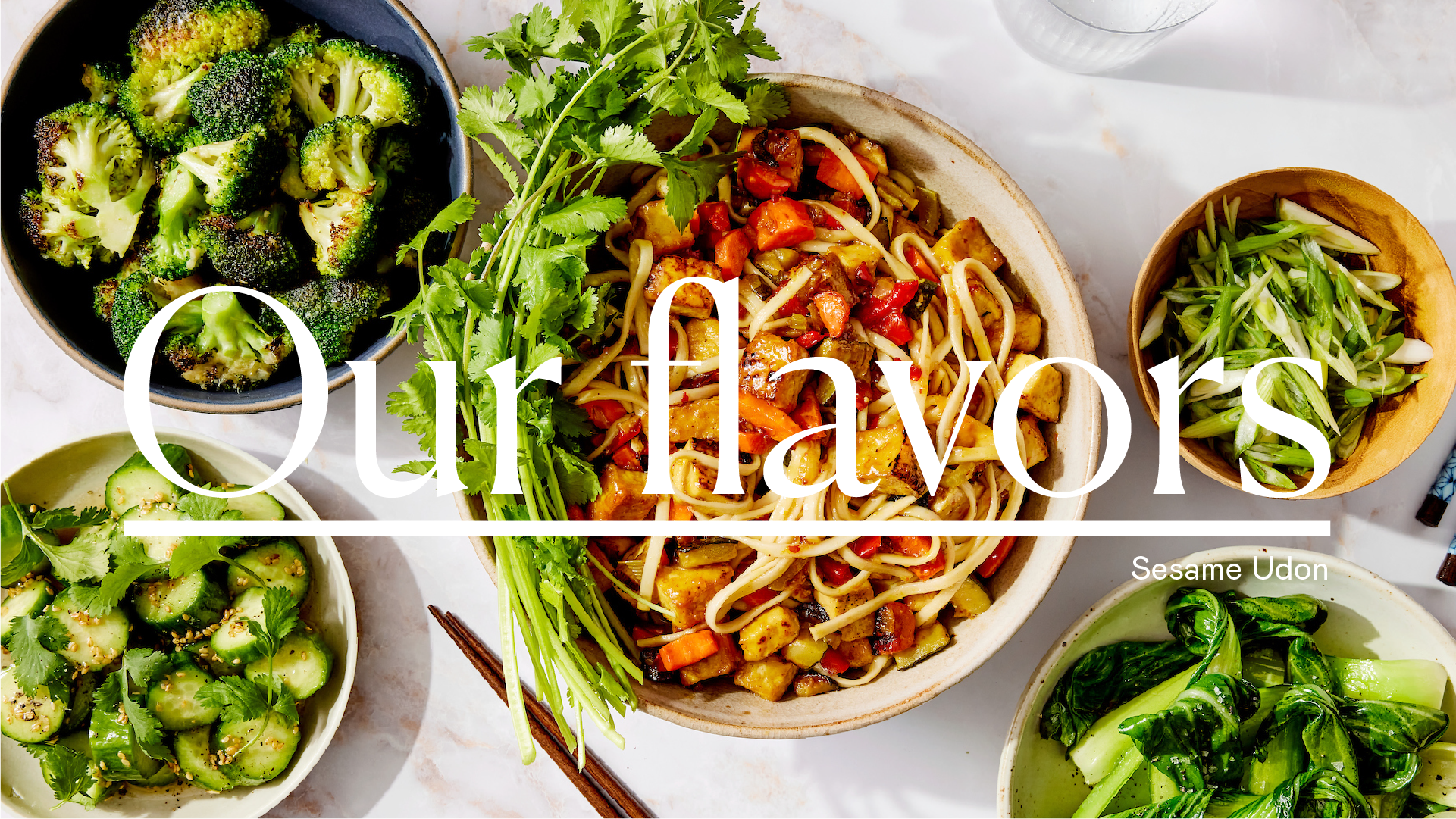
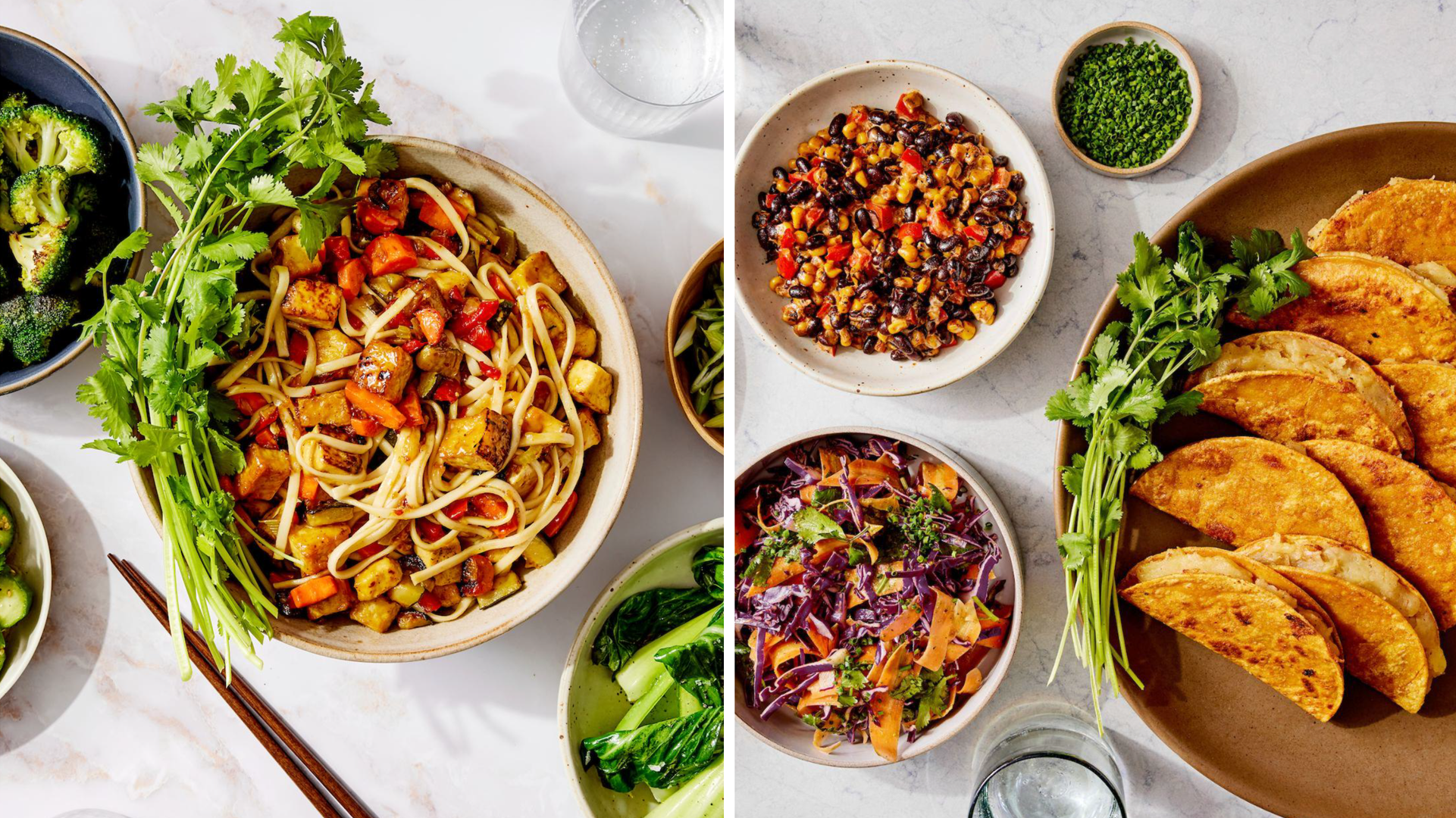
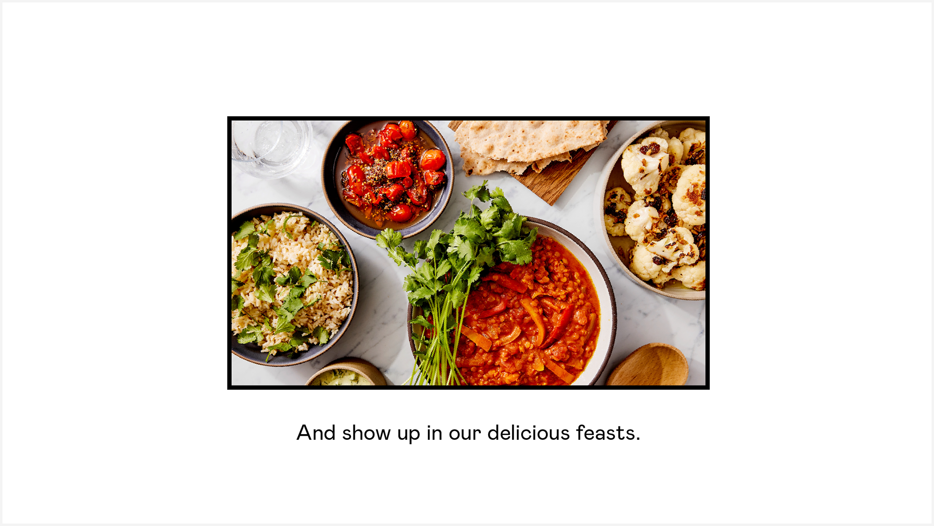
Starting with their hero product – delicious, plant-based food – I created a fresh approach to design, photography, color, and typography. Here are some of the results.
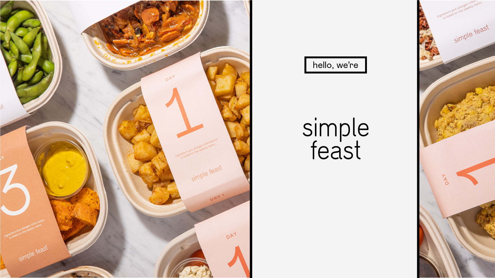
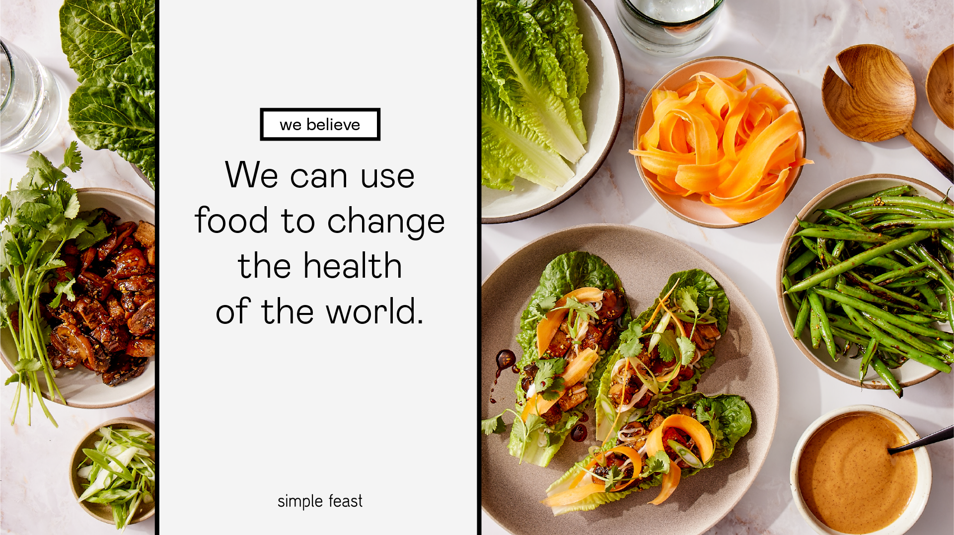

A fresh approach to photopgrahy

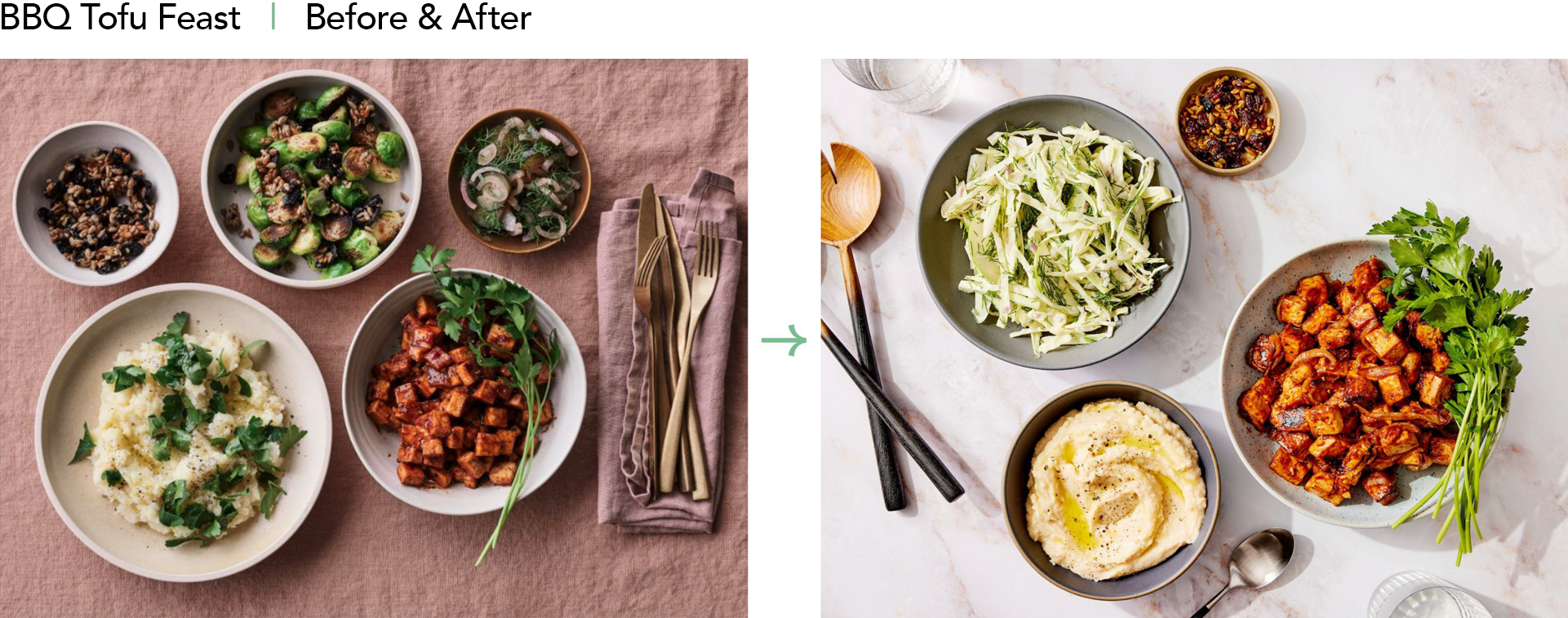

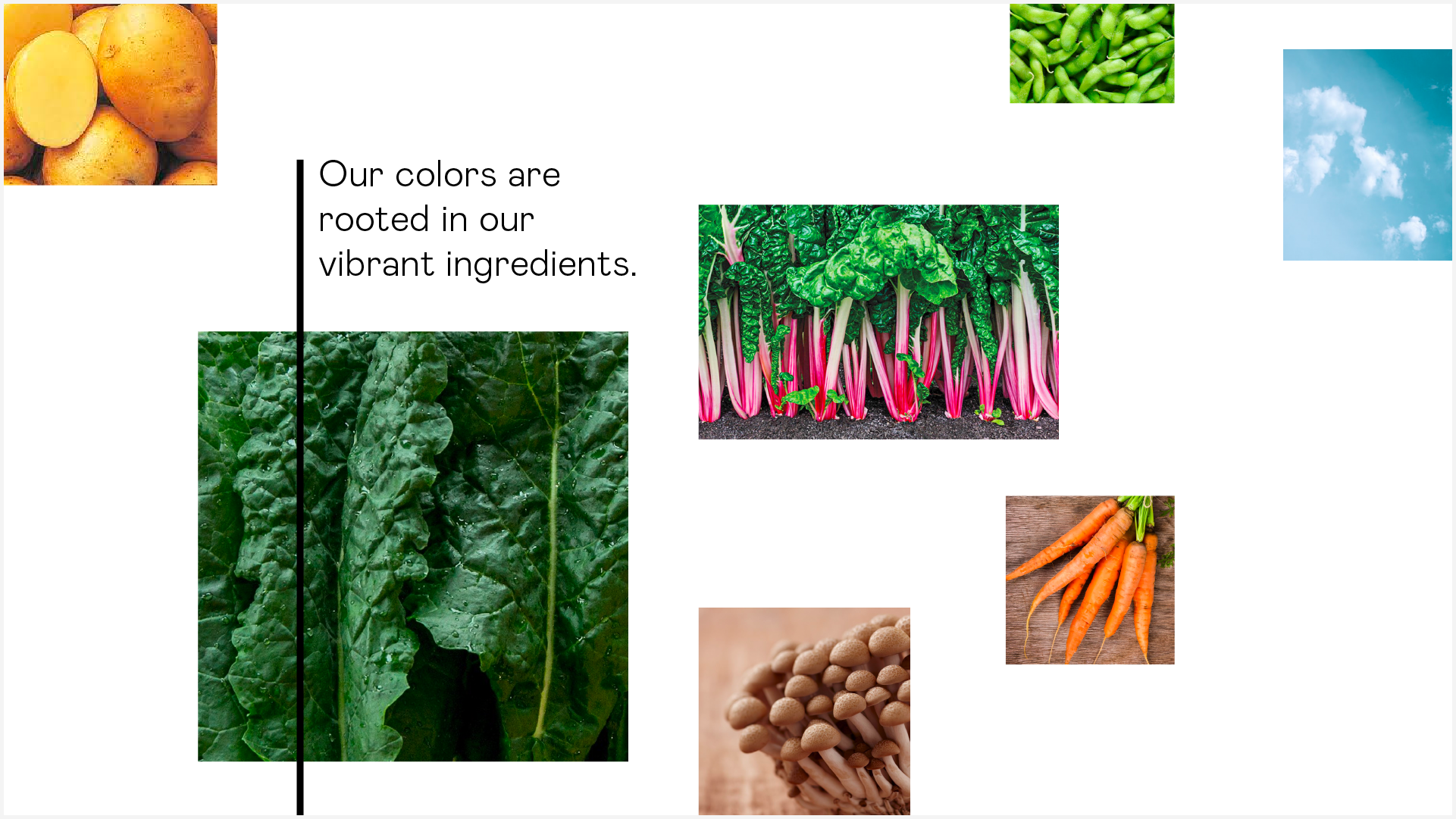
A natural shift in color


Previous brand design